Meet Owlbert, Otis College’s New Official, Student-Designed Mascot
Meet Owlbert, Otis College’s New Official, Student-Designed Mascot
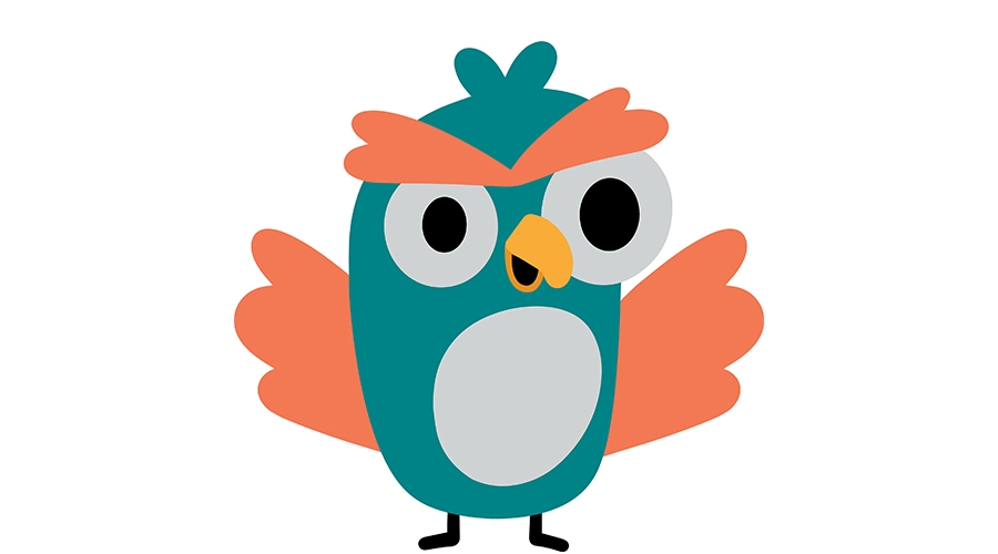
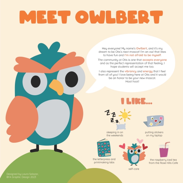
“Owlbert is a goofy little owl,” says creator Laura Salazar (’23 BFA Graphic Design).
Over 10 years ago, the Otis Community adopted the owl as the College’s official mascot. In the ensuing time, the look of the owl changed many, many times. And the poor creature didn’t have a proper name! That all changed this past academic year, when the Office of Student Engagement and Leadership not only had a campus-wide contest that landed on “Owlbert” as the mascot’s name, but also partnered with Otis Design Lab for another contest to create an entirely new look for the winged creature.
The design prompt for the undertaking was to “create a branded illustration for the College’s mascot, which would become an integral part of the Otis College brand. This mascot should be versatile (able to be applied across media) and embody the spirit and values of Otis College students.”
Design Lab students worked on various designs and identities for Owlbert (they/them), with the winning concept being the brainchild of Laura Salazar (’23 BFA Graphic Design). She describes Owlbert as “different from your typical cookie-cutter owl. They’re not perfect and that’s what makes them special. Just like any Otis student they embrace their differences, as they’re what make them unique. They’re a funny owl filled with joyous whimsy.”
Students, staff, and faculty who voted for Salazar’s Owlbert design responded to their odd demeanor—are they happy? cranky?—and the ease with which their face and posture can be adapted to different situations and environments.
Emily Carlson, Otis College’s Creative Director and Director of Design Lab—which operates within the Communications and Marketing department and is the only design studio in Los Angeles that functions through a collaboration between students, staff, faculty, and external client partnerships—was proud of the students’ understanding of the design prompt and the final results. Of Salazar’s winning concept, Carlson says, “There’s a scrappiness about Owlbert that strikes me as very authentic, and somehow very Otis.” She laughs, adding that the reason Owlbert probably appealed to students so much is because they look like they “pulled an all-nighter in the studio, they’ve had too much caffeine, and they’re a little grumpy about it.”
“Owlbert is not this majestic mascot on a flag or a pedestal… they’re like, the owl of the people.” —Emily Carlson
Carlson says Salazar had worked on a completely different version of her owl that was really cute and almost too nursery school-appropriate. “Laura got frustrated and started over, maybe even staying up all night to finish an entirely new design,” Carlson says. Salazar actually was afraid to show anyone her newer design, worrying that her owl exhibited “too much attitude.”
“But when we saw it, we were in love immediately. And so were other students when she showed it,” Carlson says. “I think she channeled her real feelings into this little owl, which is why they’re so relatable. They have these incredibly expressive eyes and eyebrows—somehow Laura has managed to condense a multitude of possible emotions into a few simple shapes, which makes the design so versatile.”
To that end, we can all expect to see different depictions of Owlbert in the months ahead on such Otis merch as mugs, stickers, and pins. Stay tuned!
Related News

Otis Design Lab Offers Real-World Experience to Otis College Students
December 08, 2023
