Daisy Verduzco
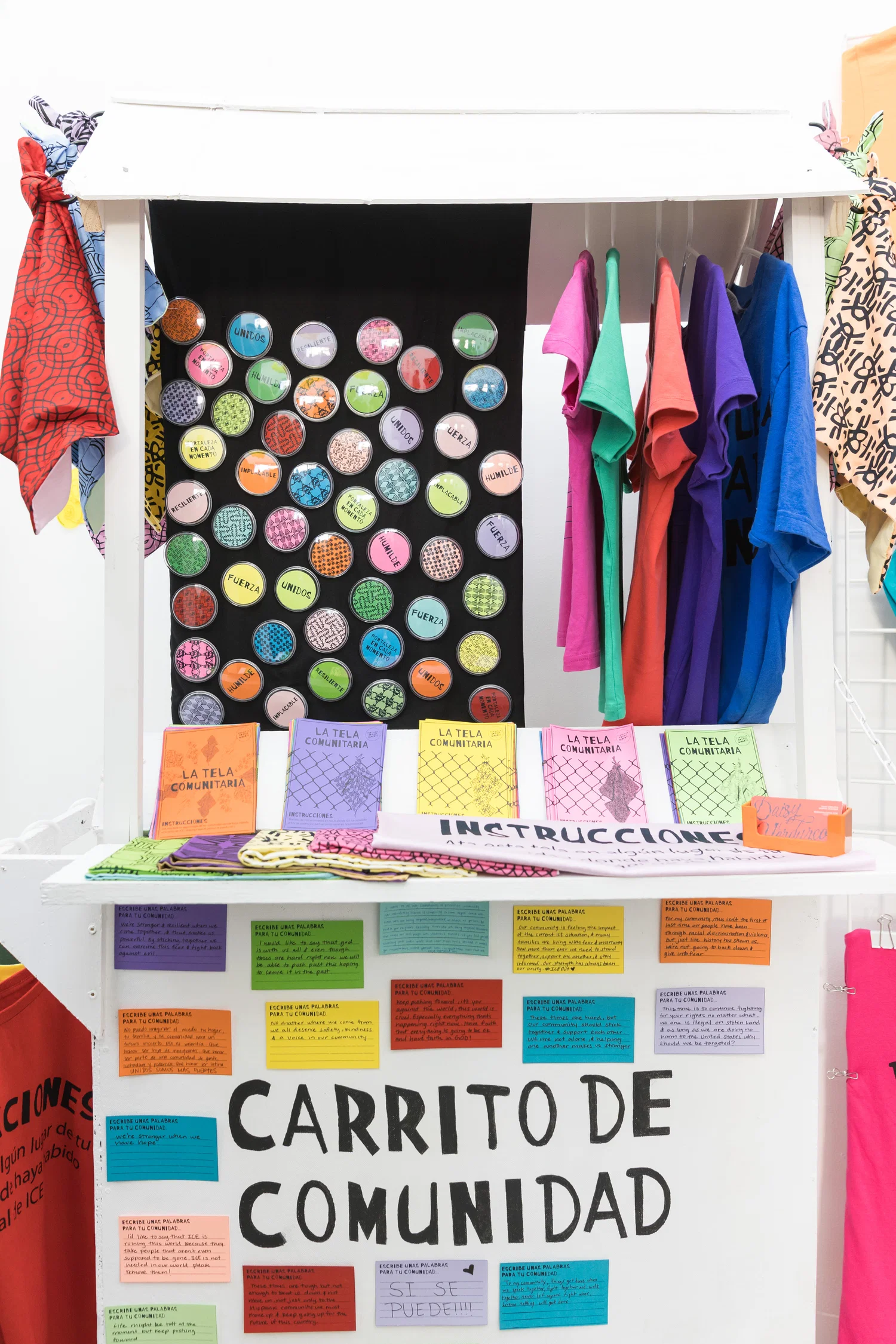
Fortaleza en Cada Momento: Analog-Ritual as DecolonizationSome images may be cropped. Click on an image to see the full image without cropping.
Daisy Verduzco
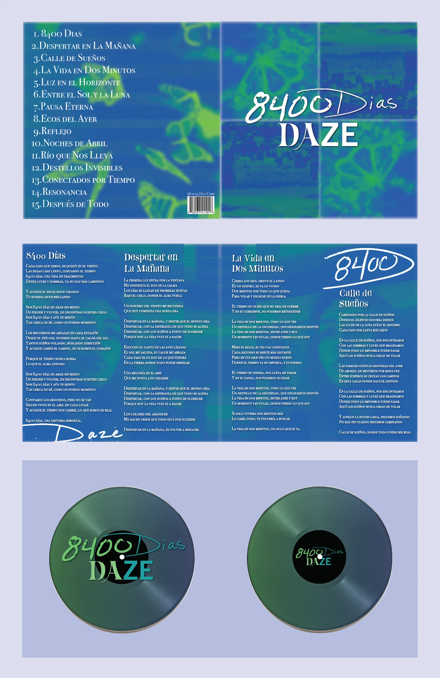
Brand identity created for an alter-ego musician. Daze is a Mexican-American artist whose music blends both Spanish rock and indie pop. The album 8400 Dias celebrates the artist’s 23rd birthday and depicts the experience of having lived 8400 days with a dual identity. The imagery, color palette and consistent moves represent the artists dual identity and music album.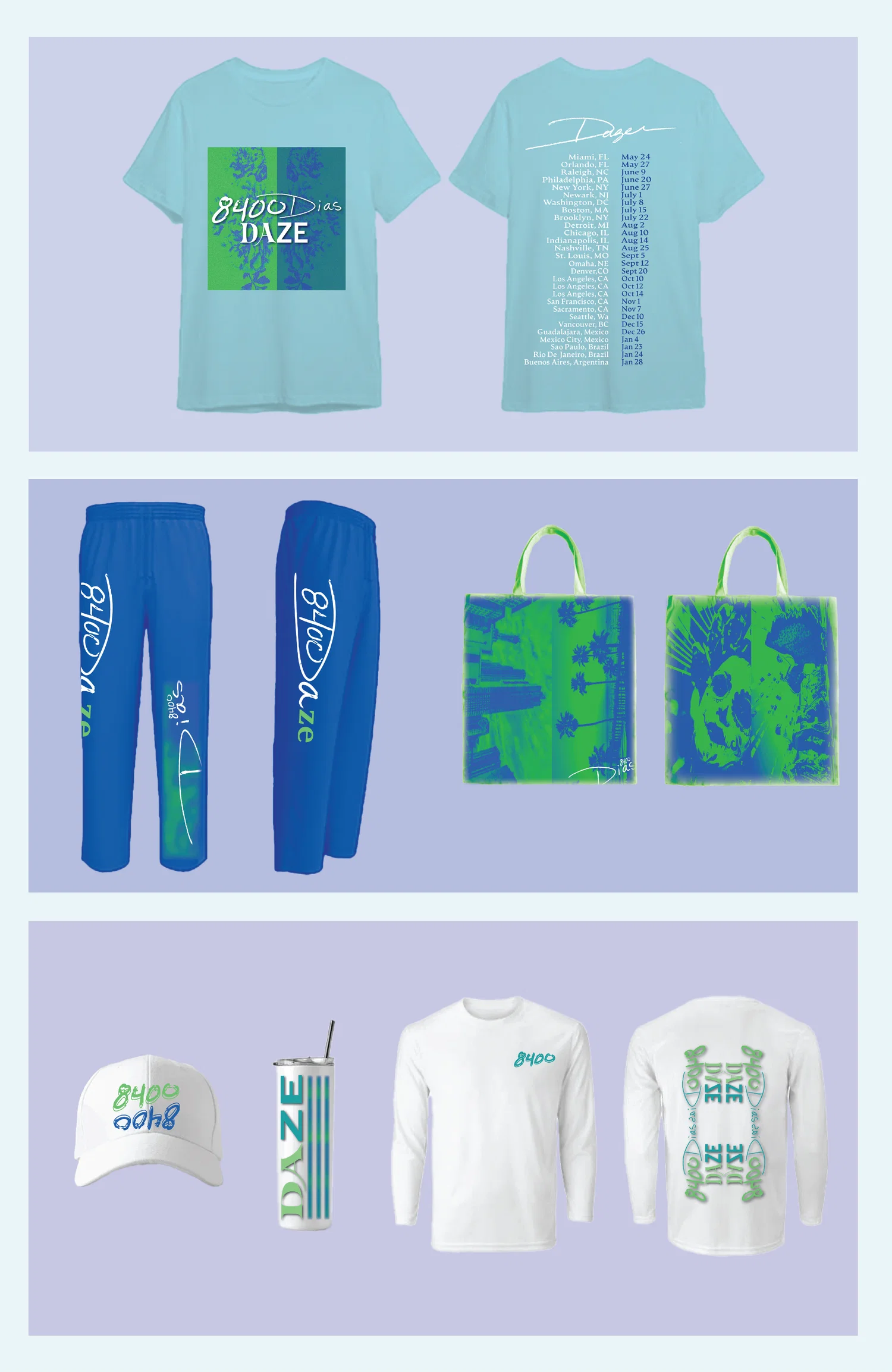
Daisy Verduzco
Brand identity created for an alter-ego musician. Daze is a Mexican-American artist whose music blends both Spanish rock and indie pop. The album 8400 Dias celebrates the artist’s 23rd birthday and depicts the experience of having lived 8400 days with a dual identity. The imagery, color palette and consistent moves represent the artists dual identity and music album.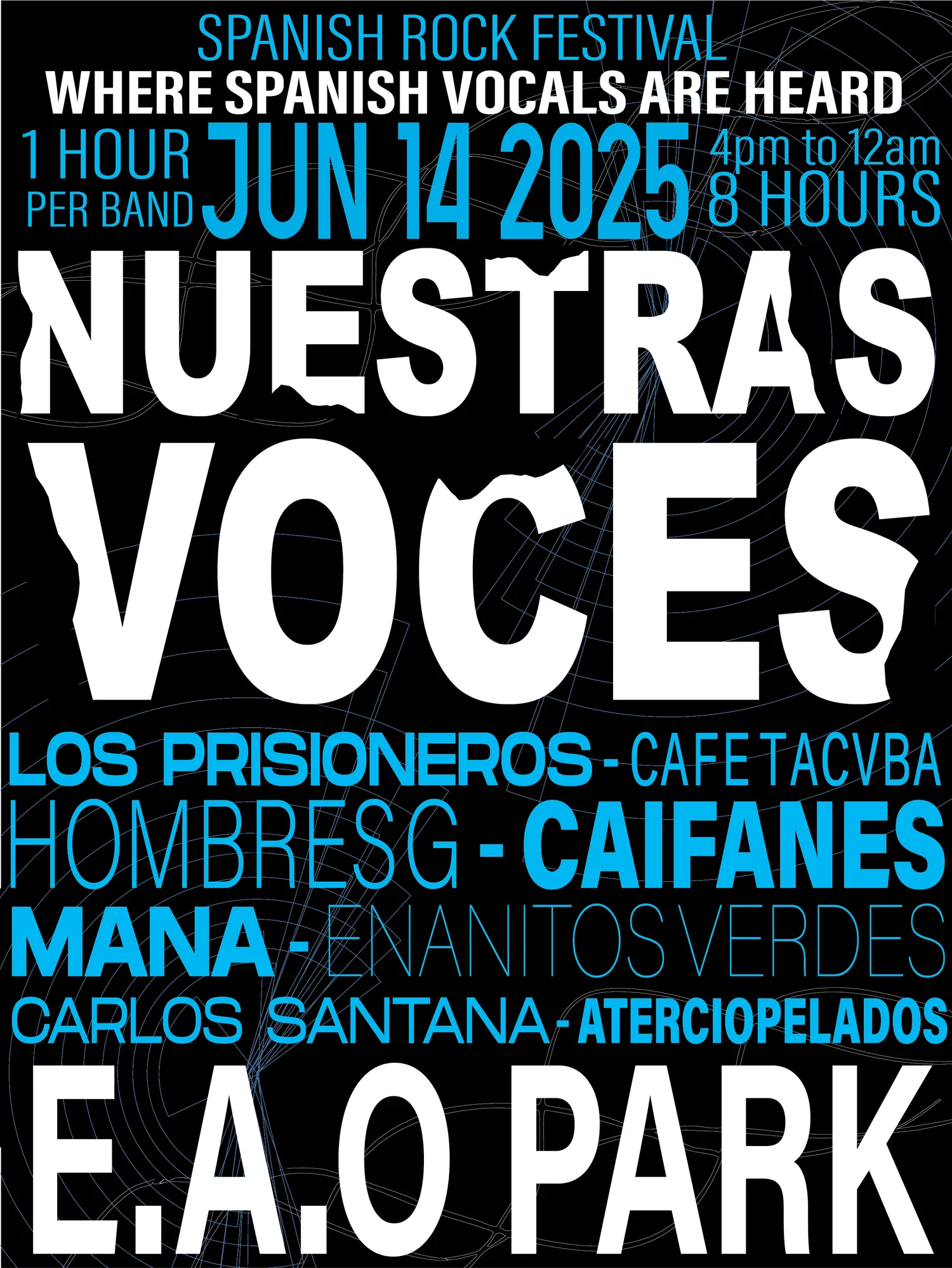
Daisy Verduzco
Typographic brand identity created for a Spanish rock music festival in Los Angeles. The identity uses visual representations of sound waves, rock forms and bold type to place emphasis on the genre of music. This festival prioritizes Spanish vocals by making a sub-genre of rock music more known.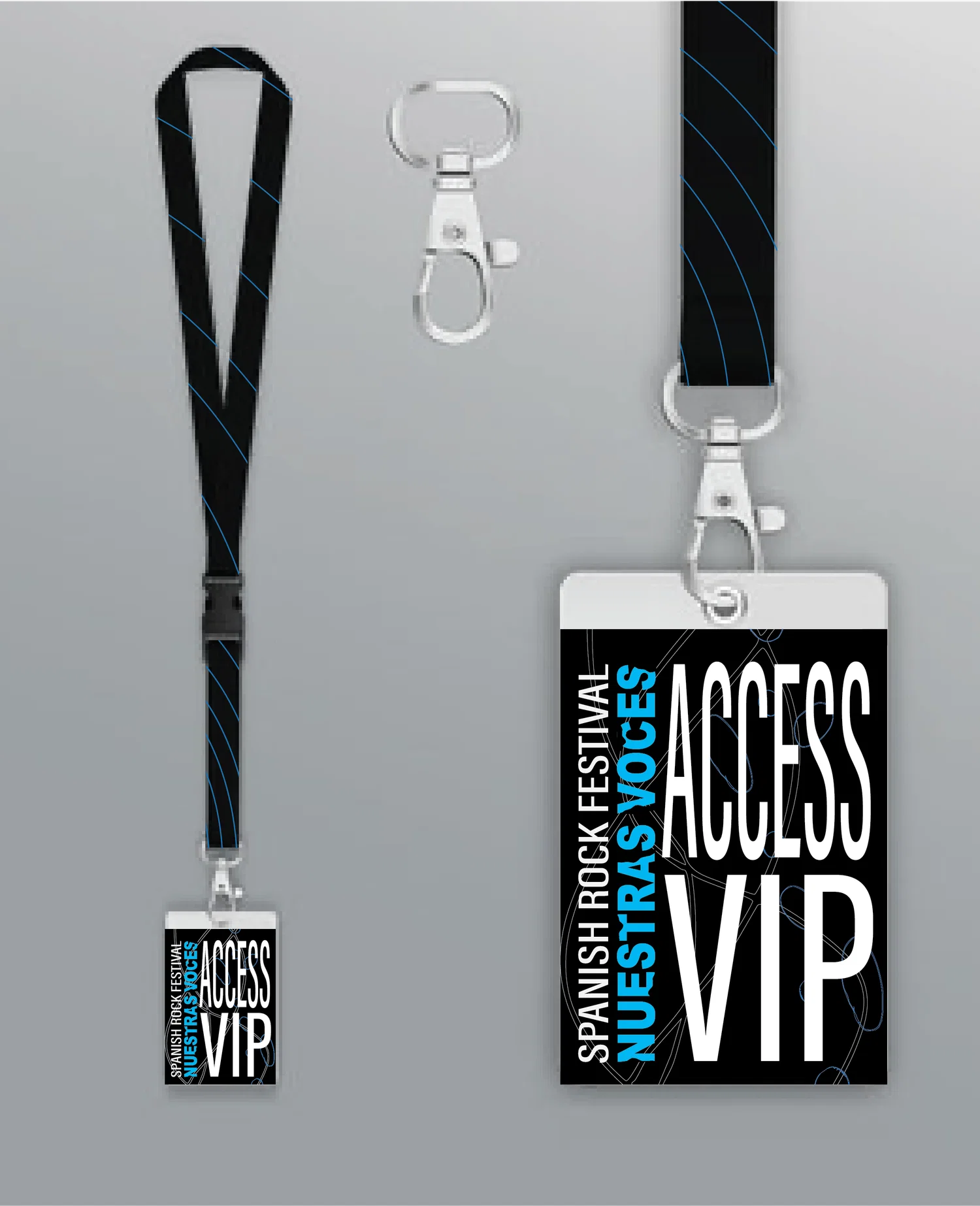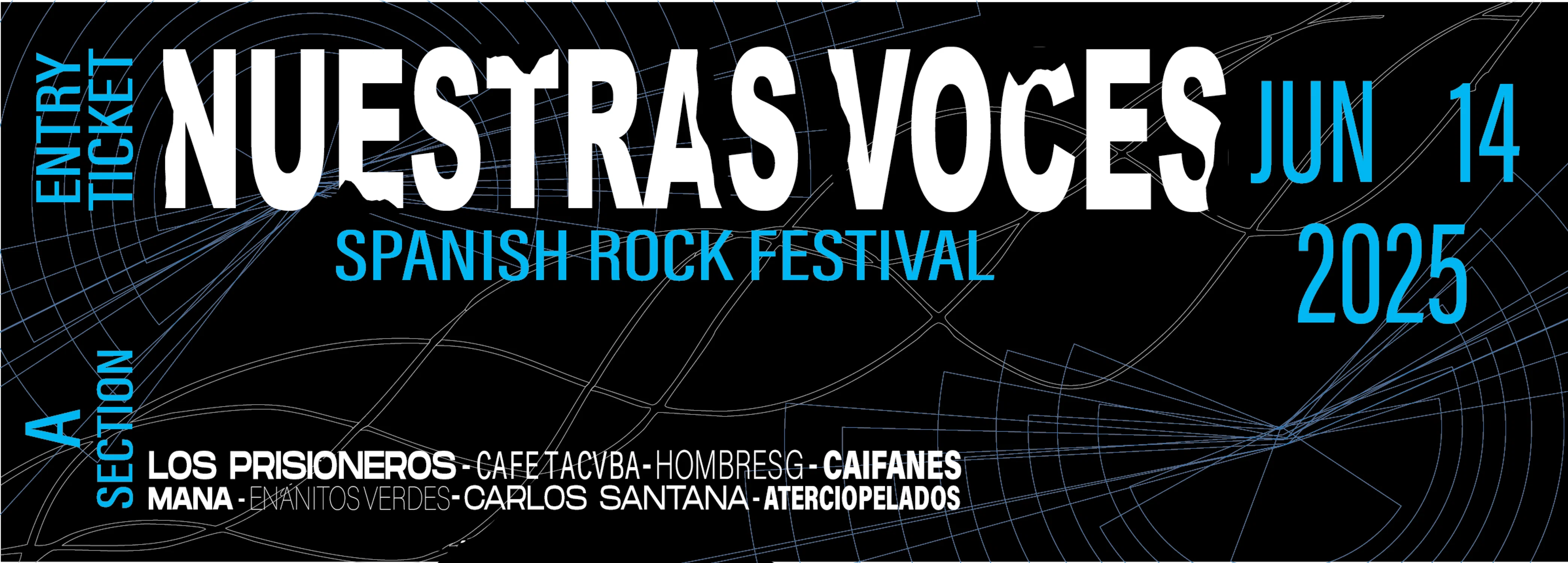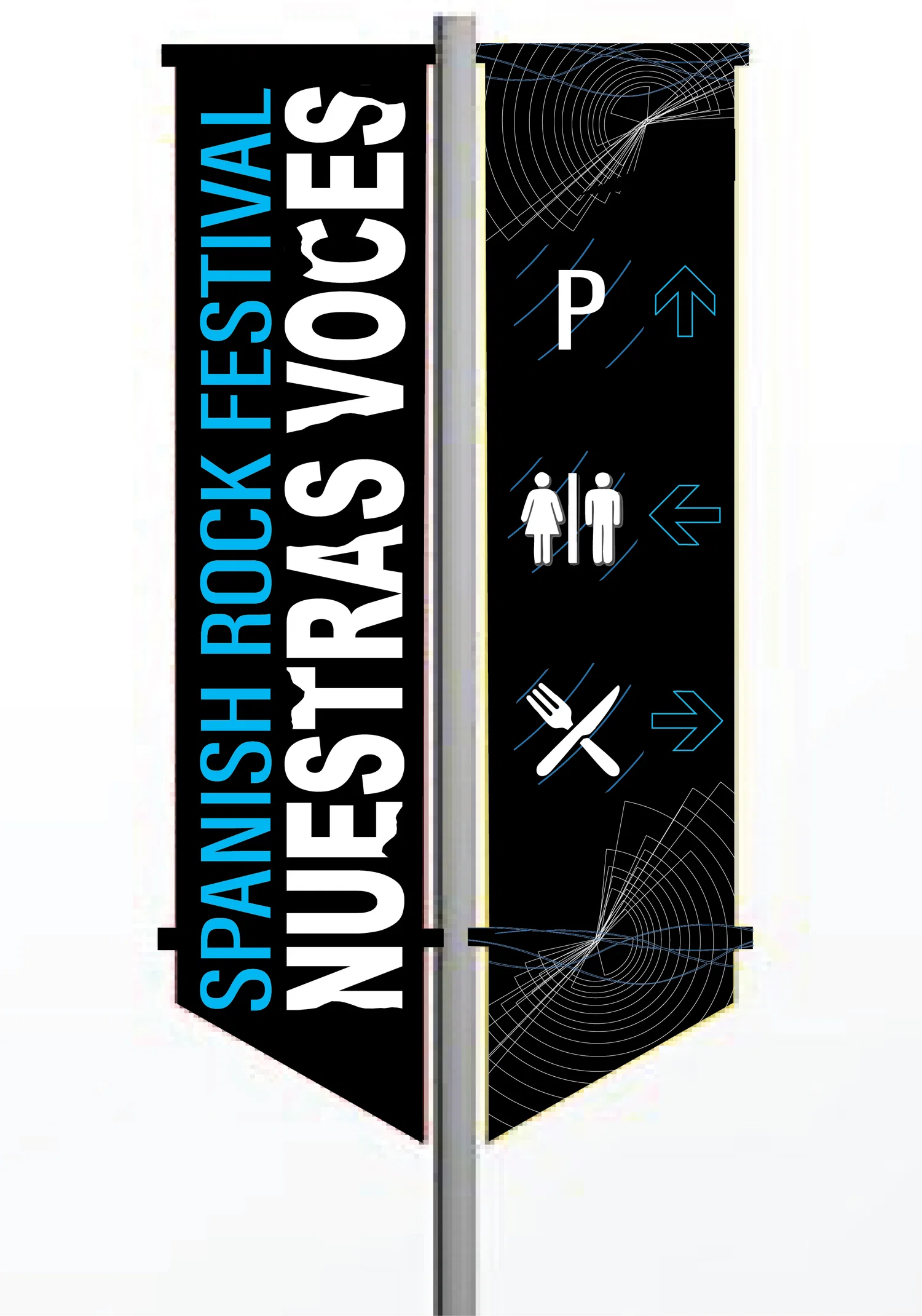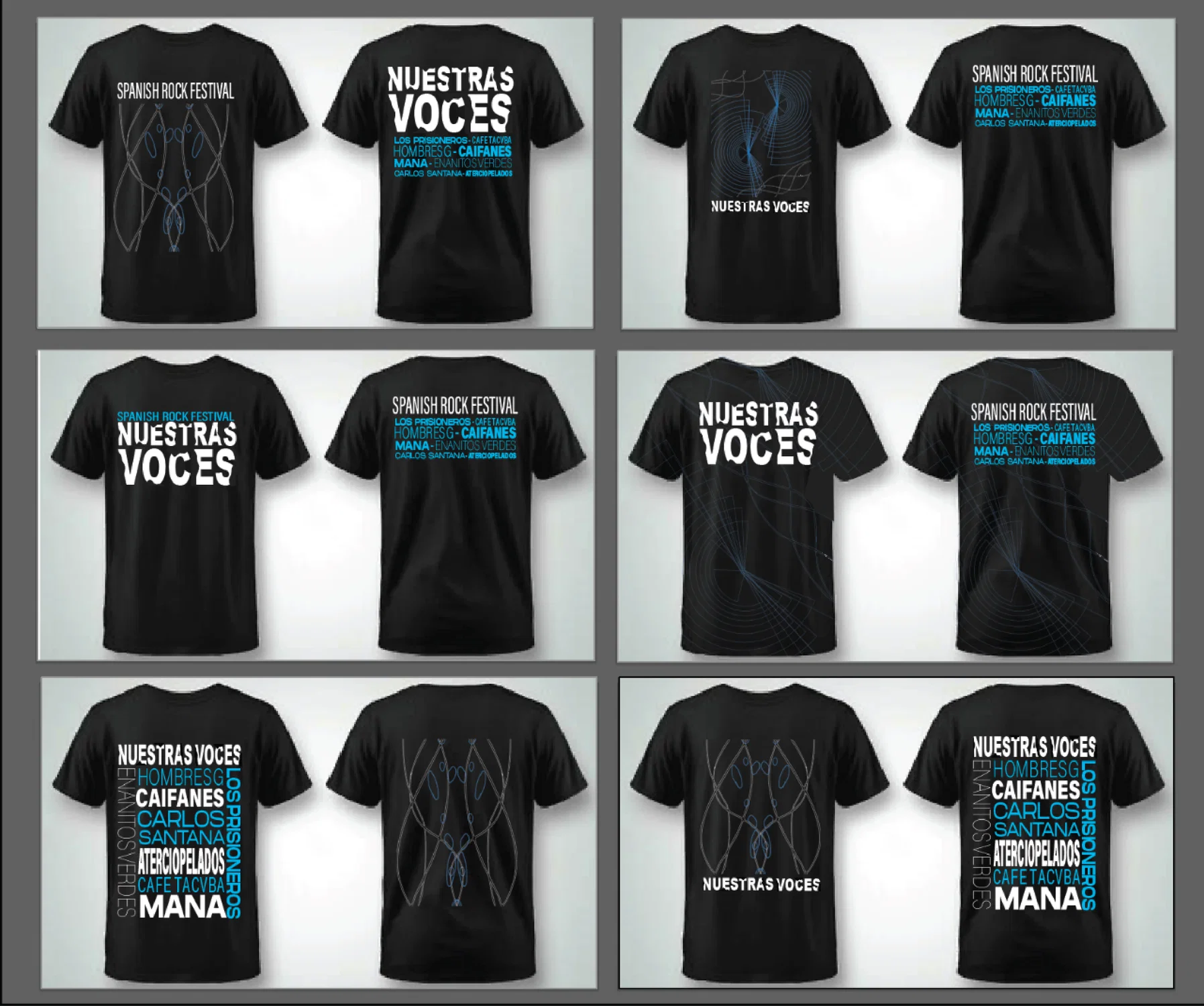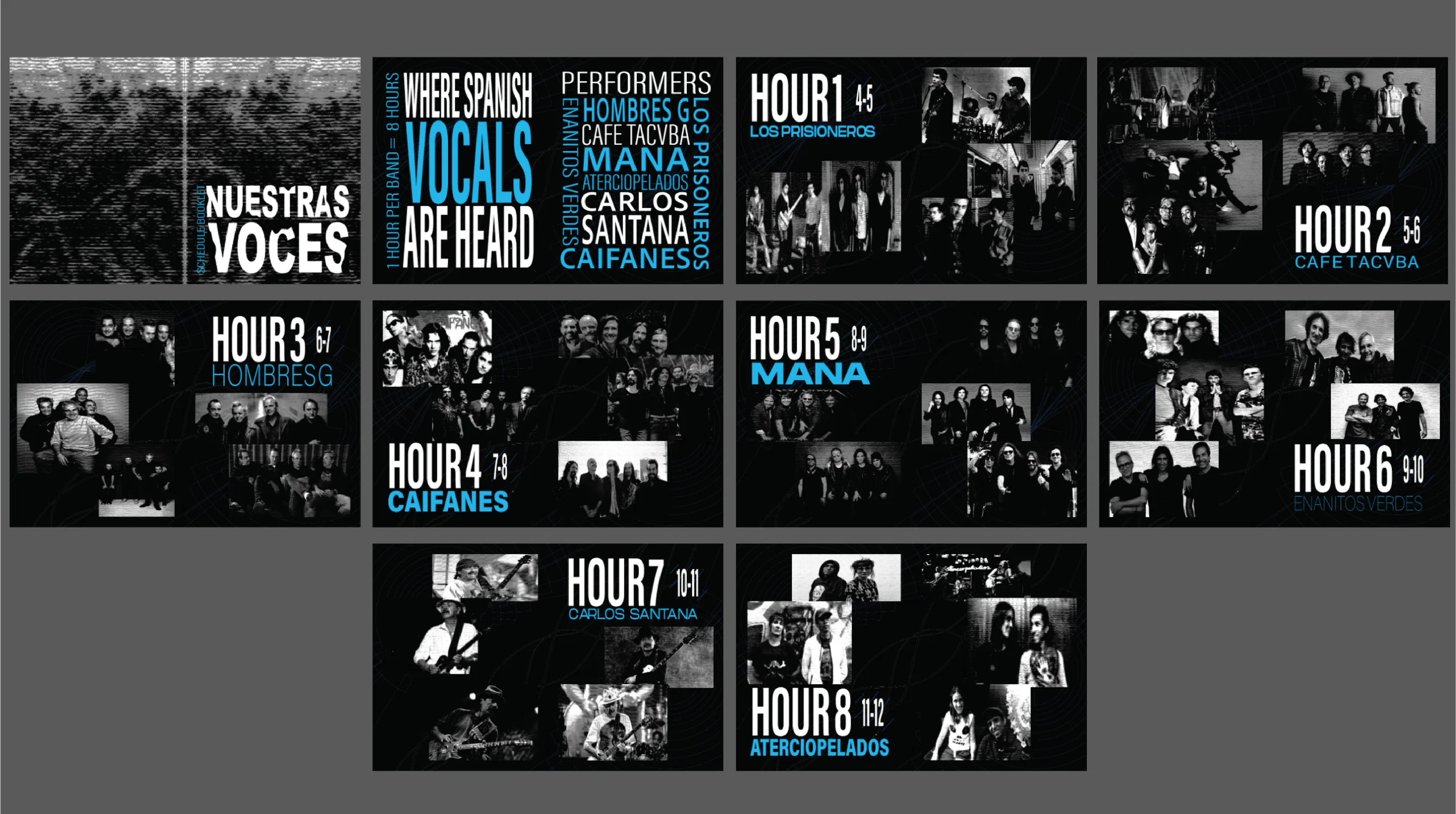
Daisy Verduzco
Typographic brand identity created for a Spanish rock music festival in Los Angeles. The identity uses visual representations of sound waves, rock forms and bold type to place emphasis on the genre of music. This festival prioritizes Spanish vocals by making a sub-genre of rock music more known.Daisy Verduzco
Product campaign inspired by the makeup collection released by Beauty Creations in collaboration with the Mexican table game Loteria. The campaign consists of a marketing strategy in which an interactive website is launched by the company. This website is meant to promote the product and appeal to the target audience by giving the audience an opportunity to play the game and win the entire collection.
Daisy Verduzco
A design interface created for a fictional world in 2073 in which quarantine never ended after the Covid-19 pandemic. The citizens of patho shield city are forced to remain indoors in order to prevent catching a new disease Asepsis-9. The characters do everything via a device installed in their homes such as ordering sanitation supplies and transportation services. The government has created an isolated, sanitation obsessed and paranoid society.
Email Daisy Verduzco